HARI ANAND TRUST is a registered Public Trust and represents its service to the human kind and providing promising solutions of various issues like healthcare, education and old age challenges to deserving candidates/persons in the respective fields.
We have helped students to get through school and college by providing financial support and elderly and patients to get the healthcare services they deserve.
We are based in Vadodara, Gujarat, and have provided our support to people from various parts of Gujarat/India. We endeavor to reach many more people for years to look forward to your support and encouragement.
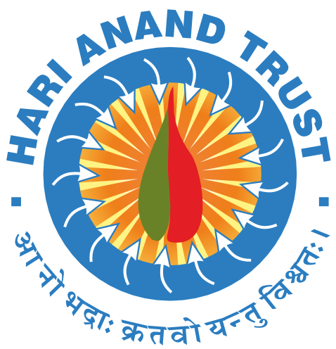
 The logo crafted for the Trust represents its service to the humankind and providing promising solutions of various issues like healthcare, education, and old age challenges. It represents both aspects with a blend of fire and a leaf in the layout. Both might seem two extremes but dealing with social service wholeheartedly is not everyone’s cup of tea. The fire...the red color represents the fire one has within him or her to serve the society. On the other, the leaf or the green tone depicts calmness or solution-oriented approach of the trust. It provides the much-needed help to the needy in various fields. It fulfills the gap that one might be having due to lack of funds or their social status, etc. The arrows coming inwardly towards the core of the logo, are a straightforward message of the Trust’s tagline.
 आ नो भद्रा: क्रतवो यन्तु विश्वतः Which means: Let noble thoughts come to us from all directions. The blue circle behind the arrows in the aura the institute creates with its motto. Blue color shows calmness, tranquility, and trust. The sun rays coming from the logo’s core is the light that Hari Anand Trust emits to bring smiles for the people they serve. It brings a ray of hope for them. It gives them second life by allowing them to achieve their goals be in good health or education. They are also a huge support to the old and needy! The fonts used for the Trust name are simple and blue in color. It shows the character of the institute and its approach. Overall, a holistic way to make world a better place.
● Registered under Bombay Public Trust Act 1950, on 24/03/2008
● Registration No. E/6970/Vadodara
● PAN No. AAATH7058K
● Registered with the office of the Commissioner Income-Tax, under section 12A [Subsection (i) of clause (ac) of sub section (1)] vide registration No. AAATH7058K25AD01 Dated 24-01-2026 Valid up to 31-03-2031
● Registered with the office of the Commissioner Income Tax, under section 80G [clause (i) of first proviso to sub-section (5)] vide registration No. : AAATH7058K25AD02 dated 24-01-2026 Valid up to 31-03-2031.
● All individual and corporate donations are eligible for exemption under section 80-G of Income Tax.
● Registered with Ministry of Home Affairs under Foreign Contribution (Regulation) Act 1976,( Prior permission on 14/08/2019,Registration No. 2019005001.
● Registered with the office of the Ministry of Corporate Affairs, New Delhi for undertaking CSR activities, registration No. CSR00003354 dated 23.04.2021.
To help humanity for the betterment in education, healthcare, and in their senior years,
To serve individuals and families in the poorest and most vulnerable communities. To ensure that Children growing up in poverty get an excellent education. To enhance quality of life for all as we age.
